Step 1
Collect
It connects to the platforms where the data already lives and brings it in every day. Nobody exports anything or fills in a spreadsheet.

+CAPFAPrimary Care
Running an EAP today means logging into one platform for activity, another for pharmacy and an email full of spreadsheets for whatever isn't in either. +CAPFA collects that data every day, cross-references it and leaves it ready to look at.
Already in use at






What changes
Before
With +CAPFA
What +CAPFA is
Today every team analyses its health data by jumping between several tools. +CAPFA brings that work into one place: it collects and processes the information automatically and returns each centre's performance as charts.
Step 1
It connects to the platforms where the data already lives and brings it in every day. Nobody exports anything or fills in a spreadsheet.
Step 2
It organises it by centre, clinician, indicator and month, with the same criteria for everyone. That's what makes two centres comparable.
Step 3
It cross-references, calculates and builds up history. Look up an indicator and you have it for every centre and the whole year, not just the current month.
Step 4
It returns it as charts and tables: each centre's progress and performance, ready to look at and to take into a meeting.
From any deviceIt opens in the browser, with nothing to install. On the consulting-room computer or on your phone on the way to a meeting.
With controlled accessEveryone signs in with their own account and sees the centres and indicators that apply to them.
Try it from the inside
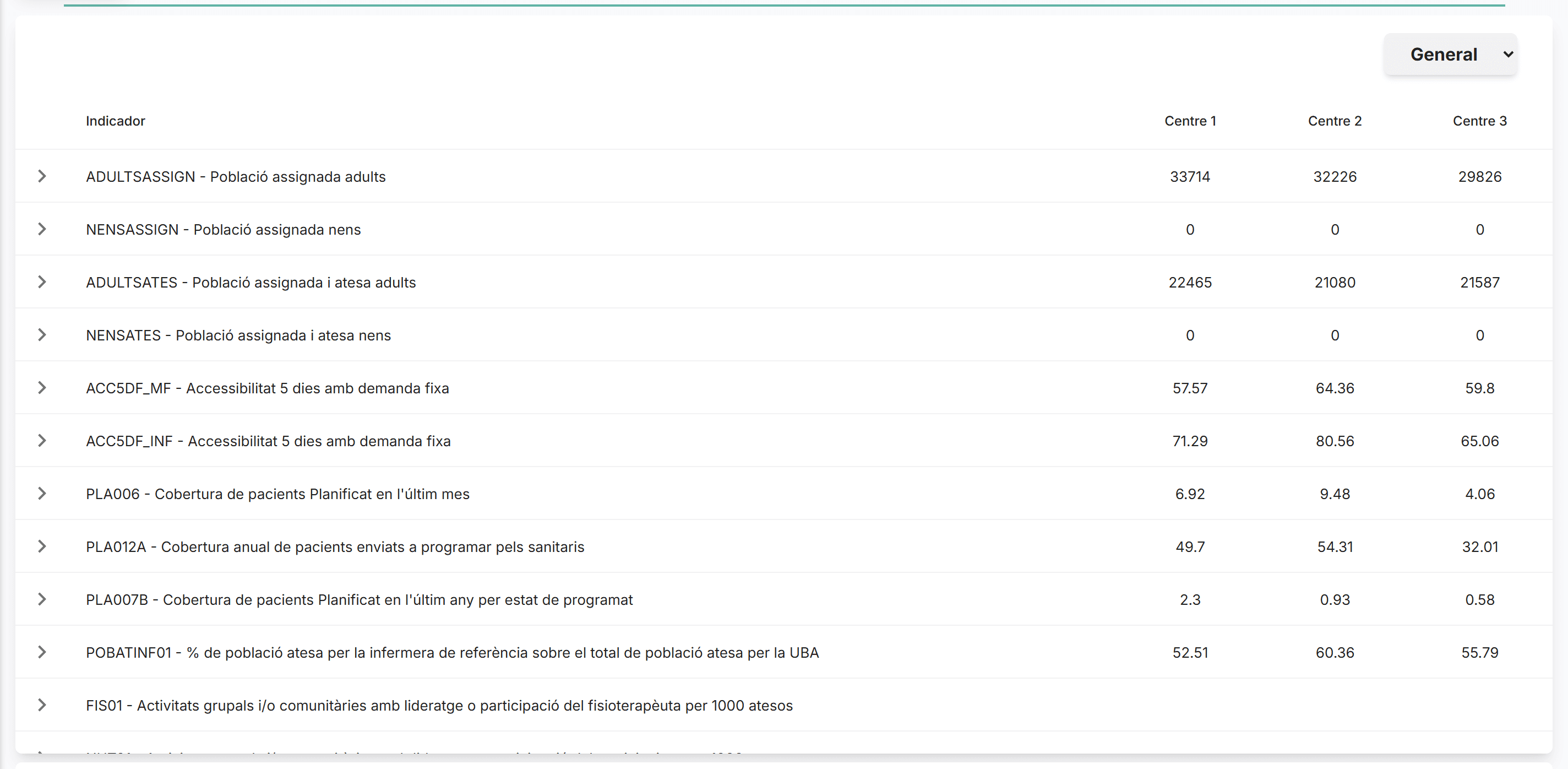
Four of the eleven screens, with the demo dataset: switch section, pick a centre, expand an indicator or change the year. The locked screens and the month-by-month detail are shown in a session with you.
Quadre Comandament
1Dashboard
The EQA and activity indicators for all your centres on the same chart, month by month. No exporting and no lining up date ranges to compare them: they arrive already compared.
2Accessibility and waiting times
Two questions answered together. A centre can pick up calls quickly and still offer appointments fifteen days out, and looking at them separately doesn't tell you that.
3Pharmacy · IQF
The full IQF for all three centres in one table: value, score against the maximum, and whether it's improving or worsening on the previous month. Also by clinician, to see the spread within the same team.
4Clinical orders
Diagnostic test requests by catalogue code and centre. Useful for spotting deviations between teams that do the same work and for preparing the conversation with the data in front of you.
Who uses it
«Als EAPs Sarrià, Vallvidrera i Les Planes tenim accés a múltiples plataformes d'informació, i gràcies a SOIDEM disposem d'un quadern de comandament que ens simplifica l'accés a totes aquestes dades en un sol visor.»
«Els vam fer un requeriment específic i ens han retornat un producte molt més potent del que esperàvem. Tecnològicament ens han sorprès gratament, i ja els hem recomanat sempre que hem pogut.»
3
centres in the same viewer
Sarrià, Vallvidrera and Les Planes, each with its own data and comparable with one another.
11
screens at their disposal
From activity and accessibility to pharmacy and clinical orders.
«Al Consorci d'Atenció Primària de Salut Barcelona Esquerra (CAPSBE) disposem d'un Quadre de Comandament que recopila i analitza de forma automatitzada les dades d'activitat i indicadors dels nostres centres d'Atenció Primària.»
«I això és gràcies a l'equip de Soidem, que ens ha permès dissenyar un quadre molt personalitzat i enfocat a les nostres necessitats. Treballar amb ells és un plaer: són flexibles, compromesos i actuen amb rapidesa davant les nostres sol·licituds.»
0
manual exports
Collecting and cross-referencing activity data runs on its own, every day.
1
bespoke dashboard
Designed with them around the indicators they already tracked, not on a fixed template.
Try it
A short session is enough to see whether it fits: tell us which platforms you work with and what you look at each month, and we'll show you how it would look.